Paul Rand is a highly influential graphic designer, best known for his iconic designs with well-established American companies including IBM, UPS and NeXT. Paul Rand taught, wrote and inspired younger generations to design as he designs by adopting a problem-solving approach to achieve aesthetic perfection and clear communication. Rand had the ability to present information in an interesting and energetic way;
“Design is so simple, that’s why it’s so complicated”
– Paul Rand
Rand was born as Peretz Rosenbaum on August 15th 1914 into his strict orthodox Jewish home in Brooklyn, New York. From a young age, Paul Rand expressed a great interest in drawing and designing, producing work for school events and his father’s grocery shop. However as a potential career, his father argued that art would not lead him to a successful future. For this reason, Rand attended Harren High School while enrolling in night school art classes at Pratt Institute. Although he achieved 2 school diplomas, he wasn’t satisfied with the level of learning that either schools provided and would say he learnt more self taught, “had literally learned nothing at Pratt; or whatever little I learned, I learned by doing myself”. Rand spent his time in bookshops, where he discovered the works of Cassandre and Moholy-Nagy from leading European graphic arts magazines such as ‘Gebrauchsgrafik’. Paul Rand was driven by his ambition to earn more money than his parents.
Back to TopBeginning his early career illustrating for Metro Associated Services, Paul Rand had accumulated quite the impressive portfolio; he had not yet developed a particular style however it showcased a wide range of skills and creativity. It was around this time that Rand felt the need to change his Jewish name in the fear it may impair his chance of receiving work. He reluctantly shortened ‘Peretz’ to ‘Paul’ and changed ‘Rosenbaum’ to ‘Rand’ taken from his Uncle.
He believed four letters, Paul Rand,
“would create a nice symbol.”
– Morris Wyszogrod.
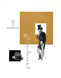
For Rand to become as influential as he did, he had to start somewhere. In 1936, Rand was hired as a freelancer to help set the page layout for an anniversary issue of Apparel Arts which is a men’s fashion magazine. “His remarkable talent for transforming mundane photographs into dynamic compositions.” Rand’s methods of design were unconventional as he opposed to following the current trends; he designed in order to stand out. This talent is what earned Rand a full-time job and position of art director for the Esquire magazine.
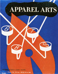
Two pieces of Paul Rand's work with Apparel Arts. Left: June 1939. Right: Summer 1936, Interior page.
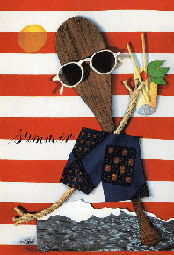
While working with Esquire magazine, Rand still found the time to complete freelance work, designing cover art for ‘Directions’ which is a cultural magazine. These covers showcased Paul Rand’s most experimental period as he was offered complete creative freedom. This allowed Rand to explore the likes of De Stijl, Constructivism, Dada and then carry this influence into his work to achieve the greatest out of visual communication. His most iconic cover with Direction was from December 1940, which uses barbed wire to represent a war-torn gift and a crucifix. Working with Direction enabled Rand to develop, experiment and expand his design techniques which refined his style and allowed him to create the work he’s known best for.
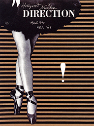
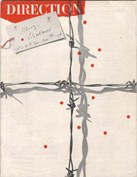
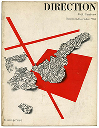
Paul Rand's work with Direction Magazine. From left: March 1939, April 1940, December 1940 and November/December 1938.
Back to TopAfter 3 years at Esquire, Rand opted for change and became the chief art-director at the newly founded Weintraub Agency which was set up by William H. Weintraub. Weintraub was originally a partner at Esquire but sold his shares in the company to open his own advertising business. This cause of change occurred after the Great Depression, when it was projected that the advertising industry was to grow as companies were willing to spend large sums of money to put their disposable income products back on the market.
Rand had the title of ‘art director’ but rarely operated as one in the traditional sense as he produced all the ideas and designed most of the concepts through his ability to problem solve rarely with the help of others. Rand would present his associates with rough sketches so that they could reproduce his ideas however Rand had the final say, he would evaluate and revaluate until the end concept was designed as he intended.
“Exercise authority but never relished disciplining others.”
– Paul Rand.
The Weintraub Agency grew considerably within a year as did Rand’s reputation in the design industry using his signature as a way of publicising himself; “a small price Weintraub had to pay for Rand’s continued employment.” Rand’s advertisements often incorporated sketchy drawings with visual puns which was very different to the rest of the design industry at the time. Some of his famous projects with the firm include clients – Dubonnet, Disney Hats, El Producto cigars and Stafford fabrics; he didn’t just design a logo and an advertisement, the logo was his illustrative main feature of each advertisement.
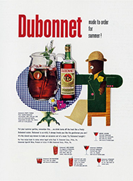
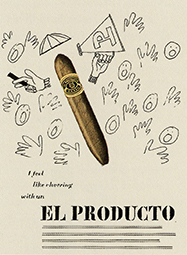
Some of Paul Rand's advertising posters designed when working at Weintraub Agency.
Back to Top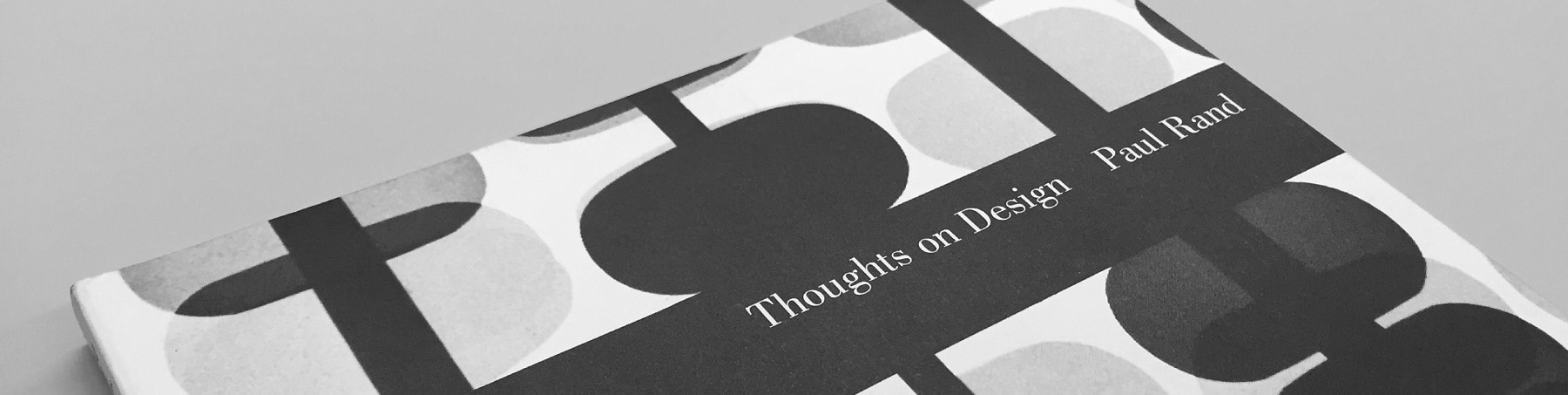
With the recognition as becoming an expert in his field by 1946, Paul Rand wrote his first book ‘Thoughts on Design’. It was recognised as a “milestone of design literature” as although many books had previously explored advertising design, Thoughts on Design was the first to explain Rand’s revolutionary ideas about the link between art and advertising. Rand expressed his knowledge of design; teaching the reader certain design principles through showcasing his own work. Rand went from earning $75,000 to $100,000 in only 5 years which was outstanding considering art directors annual salary averaged at $20-30,000 at the time – Paul Rand was improving the design industry.
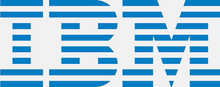
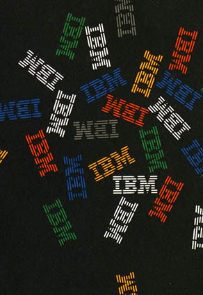
Back to Top1956 Paul Rand began embarking in one of his biggest projects, the opportunity came around to redesign International Business Machines (IBM)’s entire corporate outlook. Rand had not yet been officially commissioned to the redesign however he accepted the challenge of introducing a design system for IBM so that all aspects of their firm from the iconic logo to their packaging followed a consistent set of standards to create an overall uniform brand identity. At that time IBM “symbolised the technological revolution” and therefore required a strong brand identity to sustain this image of a reliable company. Rand took small steps in redesigning the IBM logo as the company was wary that sharp change could effectively make or break their upholding reputation. Regarding the initial design of the IBM logo which was a harsh, dark three-letter logo, Rand felt there was an issue with the sequence of lettering; that ‘IBM’ written down goes from narrow to wide without any pause or rhythmic measure. His solution was to introduce horizontal lines; this uniformity of equal lines with equal spacing is “the element of harmony that brought them together” as well as removing the harshness of the previous design. He also believed the horizontal lines gave the brand a legal sense like scan lines on a banknote; representing the authority of this American organisation. Eventually IBM accepted Paul Rand’s striped version trademark and although this IBM logo doesn’t necessarily illustrate what the company is about, the design was so successful that even today is still recognised.
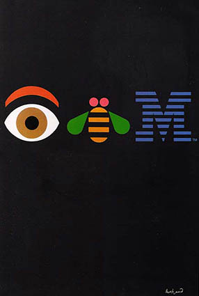
Paul Rand continued working with IBM for several years, designing various other aspects of the company; one of his posters stood out significantly. The Eye-Bee-M poster was designed in 1981 in the form of a word puzzle known as a rebus. The poster included simplistic, colourful illustrations representing each letter of IBM. While Rand was still able to incorporate their traditional logo he had fun experimenting and being creative in order to advertise the company is a unique and energetic way. Initially, managers of IBM temporarily ceased the posters distribution as they feared it would encourage in-house designers to engage in design foolishness. However, Rand prevailed and it came to be one of his most popular posters.
Being the graphic design consultant for IBM was just one part of Rand’s overall career as he too designed book covers, continuously taught at different schools and acquired work from various other American companies.
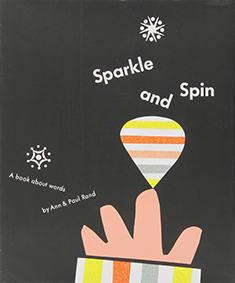
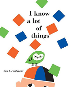
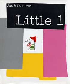
Paul Rand book cover designs. From left: Sparkle and Spin 1957, I Know a Lot of Things 1956 and Little 1 1962.
1959

Rand became the graphic design consultant for Westinghouse Electric Corporation; he was responsible for revamping their overall brand identity. Rand based his design on the existing ‘W’ and added three circles to each point in order to represent an electronic circuit board.
1961

Rand created the then United Parcel Service logo; he challenged himself to modernise the previous shield logo while still incorporating that idea as he believed it has symbolic significance for the men who wore it. After replacing the typeface and adding the gift box which sat above the shield Paul Rand had created yet another hugely successful logo which ran until the late 1990s.
1962

The American Broadcasting Company (ABC) required a logo redesign and Rand was recruited after many previous designers tried and failed. Rand suggested they be set in a lower case gothic typeface, basing the design on equal circles that comprised the negative space of the three letters. Ensuring the lettering was in white on a black circle; once again a clean, sharp trademark design for Paul Rand.
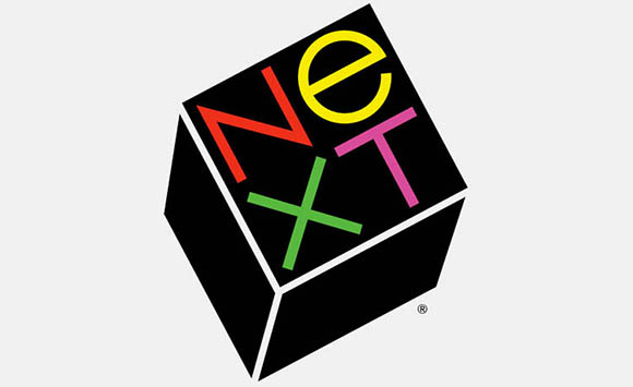
In 1986, Steven Jobs the founder of Apple Computer Company offered Rand $100,000 to design the logo for his new educational computer company known as NeXT. Rand’s logo idea surfaced from the NeXT computer itself; as it was contained in a black cube he decided to frame the word in a cube with brightly coloured lettering – a recognisable symbol of Paul Rand’s work. “IBM put rand on the map but NeXT brought him the most publicity, not only for his large fee but for the presentation booklet that convinced Steve jobs of the rightness of the solution.” Rand justified his reasons for particular type choices; he figured ‘NEXT’ could be confused with ‘EXIT’ because the ‘EXT’ grouping is so dominant therefore his solution was to use a combination of capitals and lower case letters so that there would be no confusion. He also stated that the stand lone lower case ‘e’ could stand for the likes of education, excellence or expertise; again, reflecting the NeXT brand identity. Steve Jobs was forever grateful for his collaboration with Paul Rand as he reiterated just before Rand’s death.
“The greatest living graphic designer.”
- Steven Jobs
Teaching as a Professor at Yale University for the remainder of his life, Paul Rand’s love for design shone through even until the day he passed. He too designed a mark for the Cancer Centre of Norwalk Hospital where he received treatment himself until his death in 1966 at the age of 82.
Back to TopPaul Rand’s career spanned over 6 decades; reaching the achievement of world famous corporate designs and numerous chapters of design history. Truly a master of design.

| Webpages | Books |
|---|---|
| Paul-Rand.com, n.d., Biography [Paul Rand], [online]. Available: http://www.paul-rand.com/foundation/biography/#.WiWzIrp2vg8 [04/12/2017]. | Steven Heller, 1999. Paul Rand. 1st edition New York: Phaidon Press Limited. |
| famousgraphicdesigners.org, n.d., Paul Rand [Famous Graphic Designers], [online]. Available: http://www.famousgraphicdesigners.org/paul-rand [04/12/2017]. | Paul Rand, 1993. Design Form and Chaos. 1st edition New Heaven and London: Yale University Press. |
| iconofgraphics, n.d., Paul Rand [ICONOFGRAPHICS], [online]. Available: http://www.iconofgraphics.com/Paul-Rand [04/12/2017]. | Paul Rand, 1985. A Designer's Art. 1st edition New Heaven and London: Yale University Press. |
| logodesignlove.com, n.d., All About Paul Rand [Logo Design Love], [online]. Available: https://www.logodesignlove.com/all-about-paul-rand [04/12/2017]. |