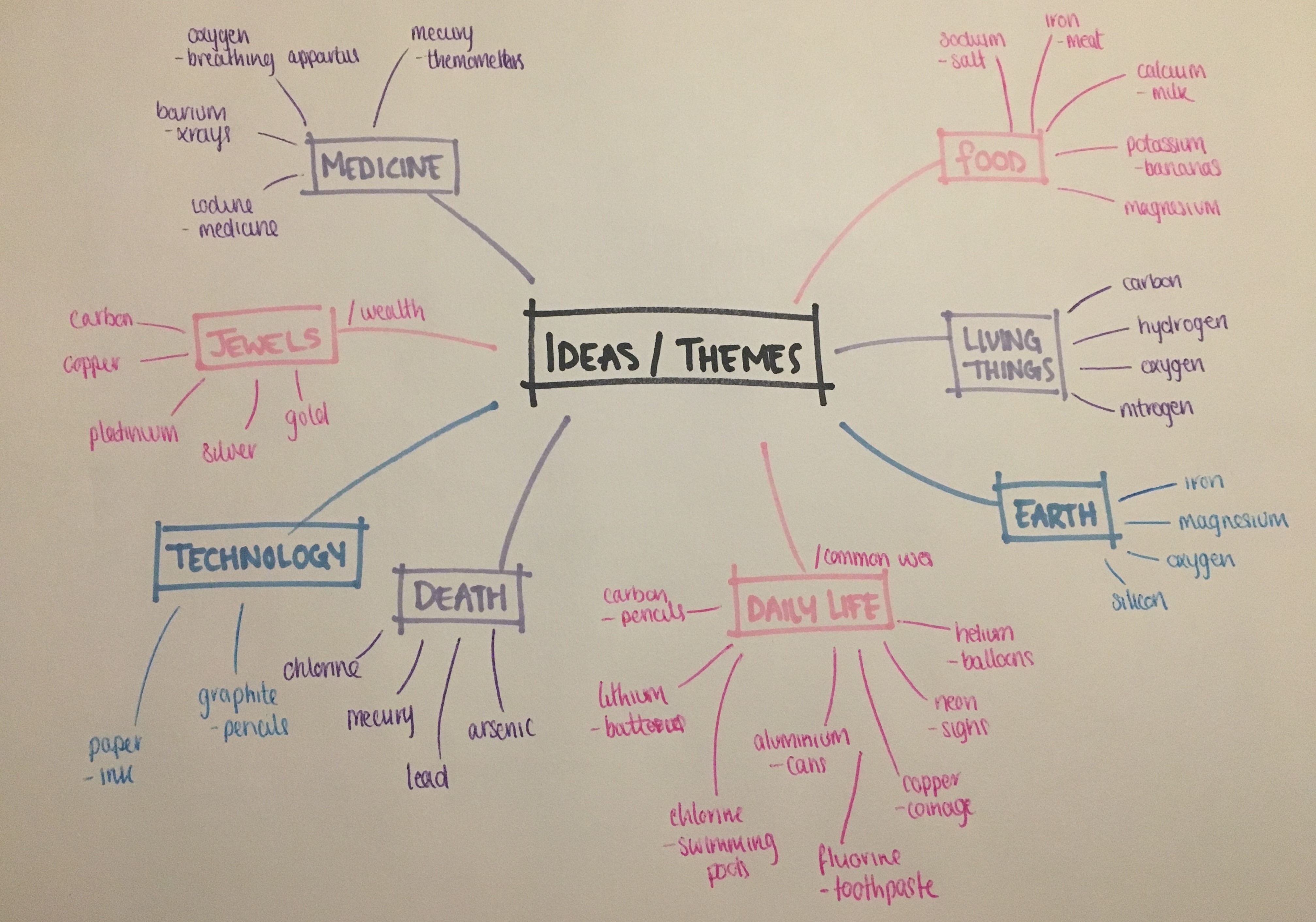
I took a trip to the Ulster Museum in Belfast, which has a large scientific section dedicated to the elements of the Periodic Table. This was so that I could gain a better understanding and begin brainstorming potential themes of how I could present my own informative website. I had to make a decision of whether I wanted my website to be directed towards a Key Stage 3 age group or high school chemistry students. Many themes explored include the elements of life, death, earth, wealth and technology.
After delibration, I chose to use the theme "Common uses" with the idea of selecting elements that children would in their everyday life, for example the Carbon element is used in their school pencils. I believed this theme would make the periodic table more relatable to children to help with their understanding of science as they can picture each element as a household object. This is done so through illustrations, which are key to aid visual learners.
Exploring Illustrations
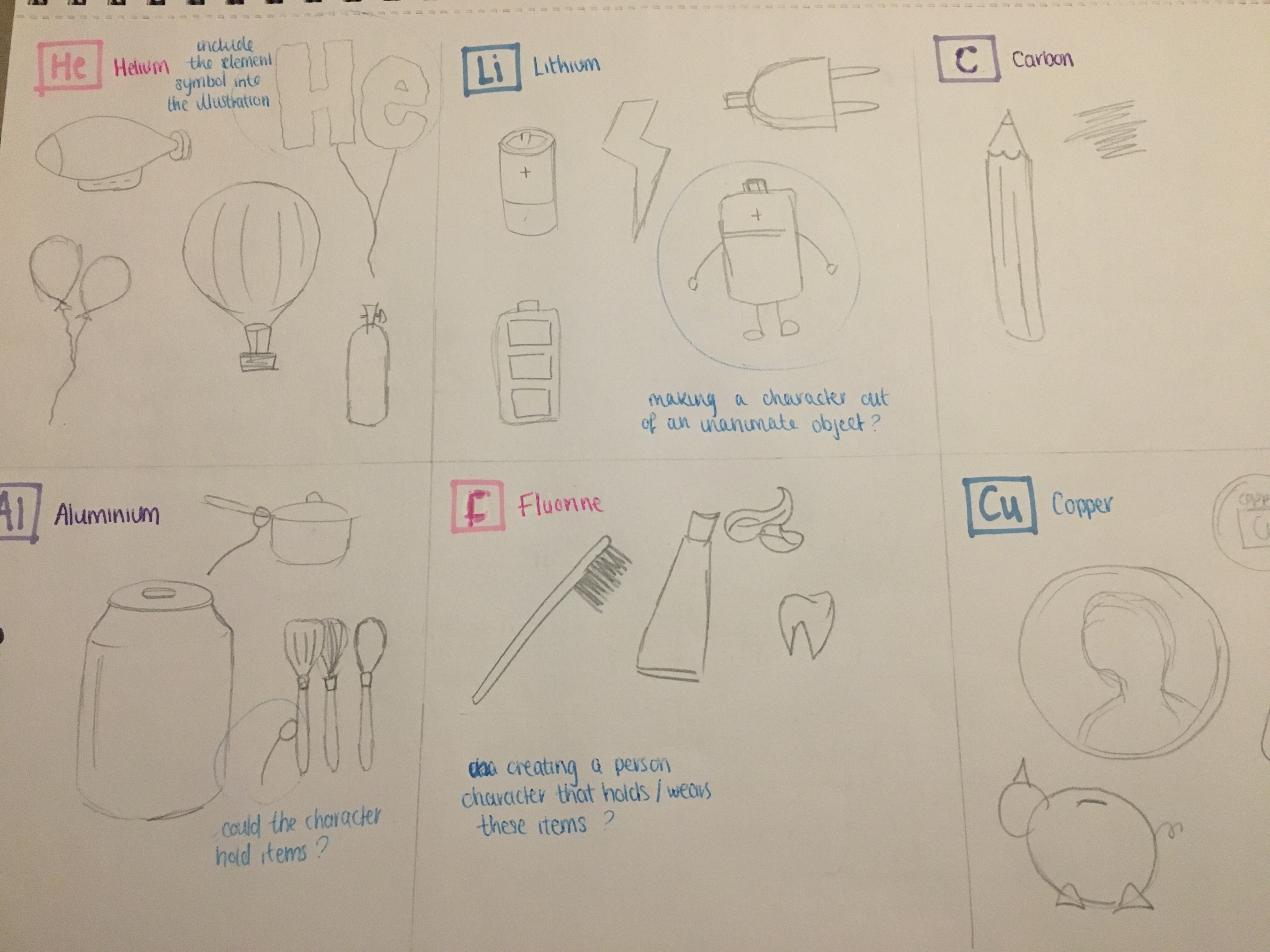
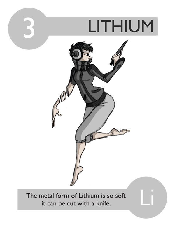
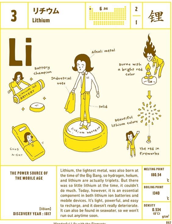
Originally I had to idea to create a few characters that would hold/wear items relating to their element. For example, a character holding batteries to represent Lithium. Kind of like how Kacie D (on the left) illustrates every element as well as the characters from 'Wonderful Life with The Elements' book (on the right). However as I began sketching out the objects, I realised that these inanimate objects could become the character. I could make batteries the character for Lithium with the addition of eyes, arms and legs. This way each character will always be different, this keeps it more simple and obvious which is easier for kids to understand and remember.
Creating Characters
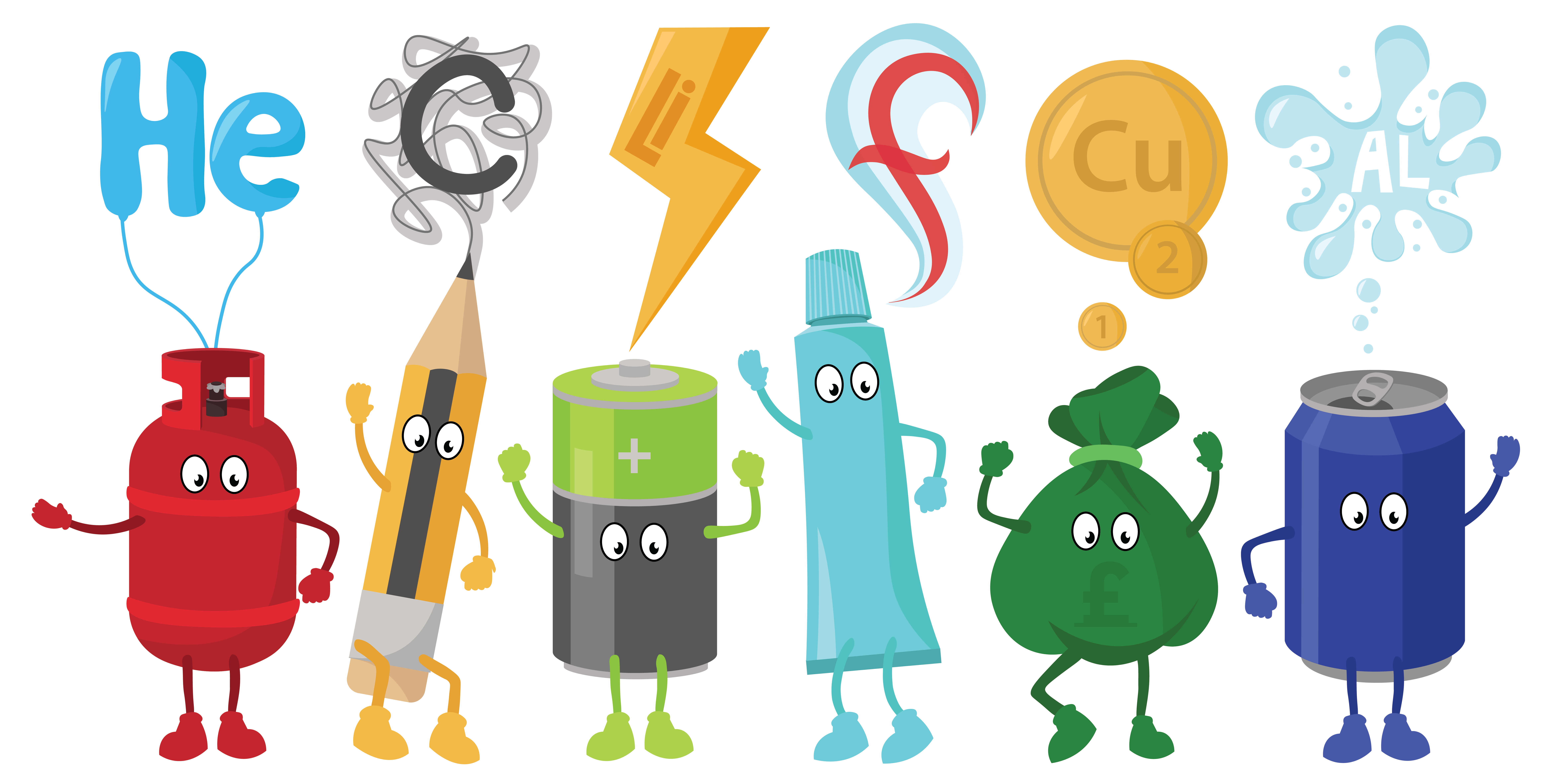
Based on my sketches I moved into creating each character digitally. Personifying each inanimate object, making sure that they follow the same style of illustration. I decided that each character should be based on a primary colour, again to reflect back on this idea that my website is directed towards kids.
User Persona
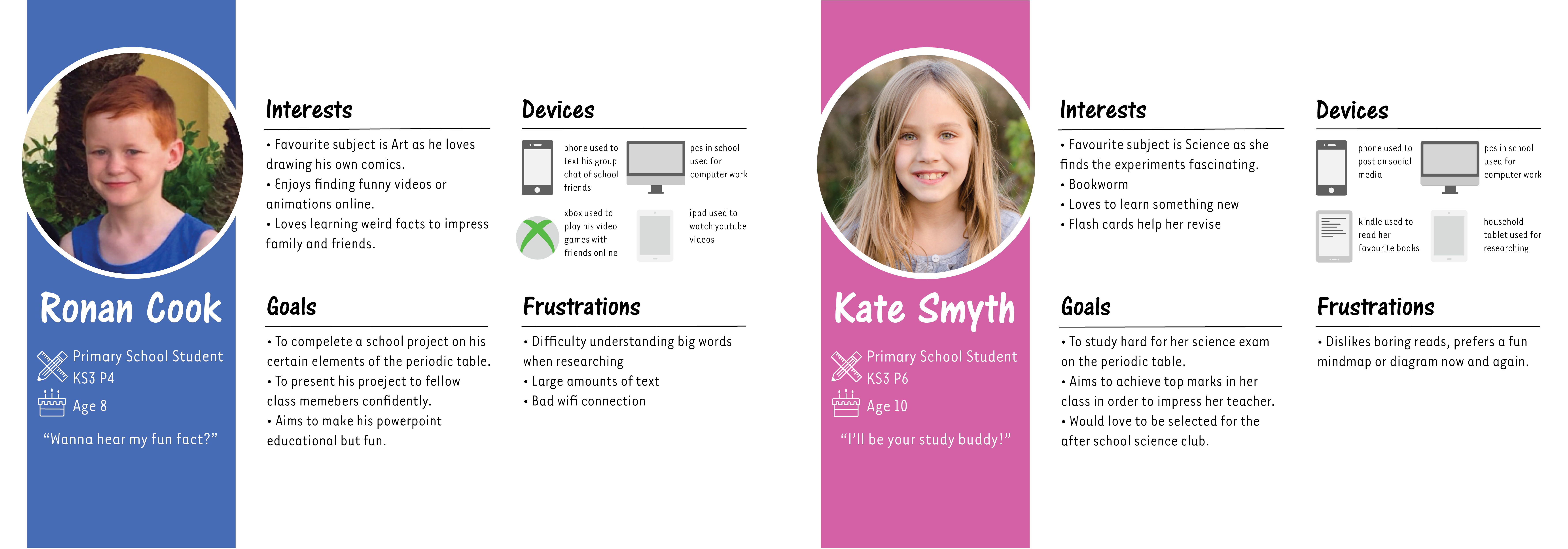
A user persona is a fictional character that represents a cluster of end users with similar characteristics. I created 2 user personas representing an audience of Key Stage 3 pupils so that I can ensure the user can achieve their goal by visiting my site. For one User Persona, I interviewed my brother who falls under the age category and the other I conducted myself who has similar but slightly different goals. These User Personas helped me to consider what is important to include on my website such as:
• Kids find researching easier to understand with the help of imagery or data visualisation elements.
• YouTube is a large part of kids lives and there are many videos regarding the periodic table available.
• Perhaps including weird or fun facts in order to make elements more memorable and interesting to read about.
• Flashcards is an idea on how to present my information of my webpage.
Paper Prototyping
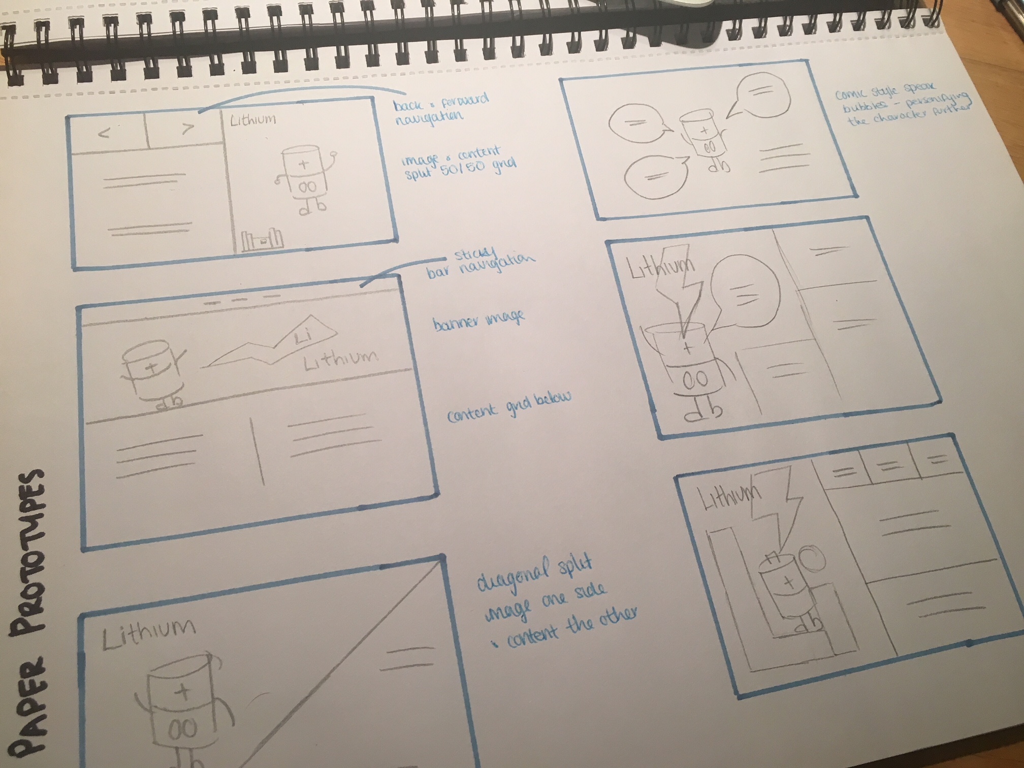
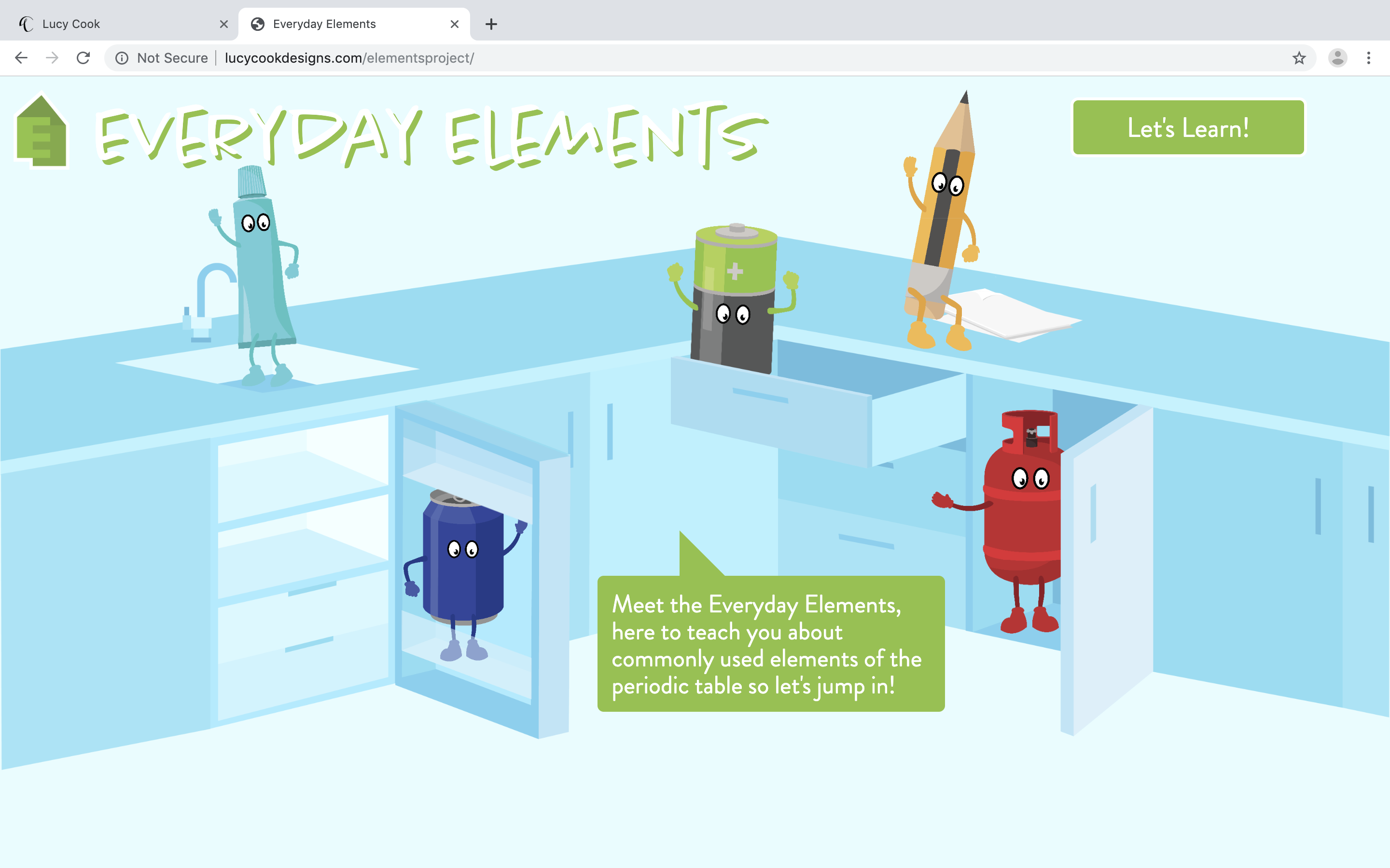
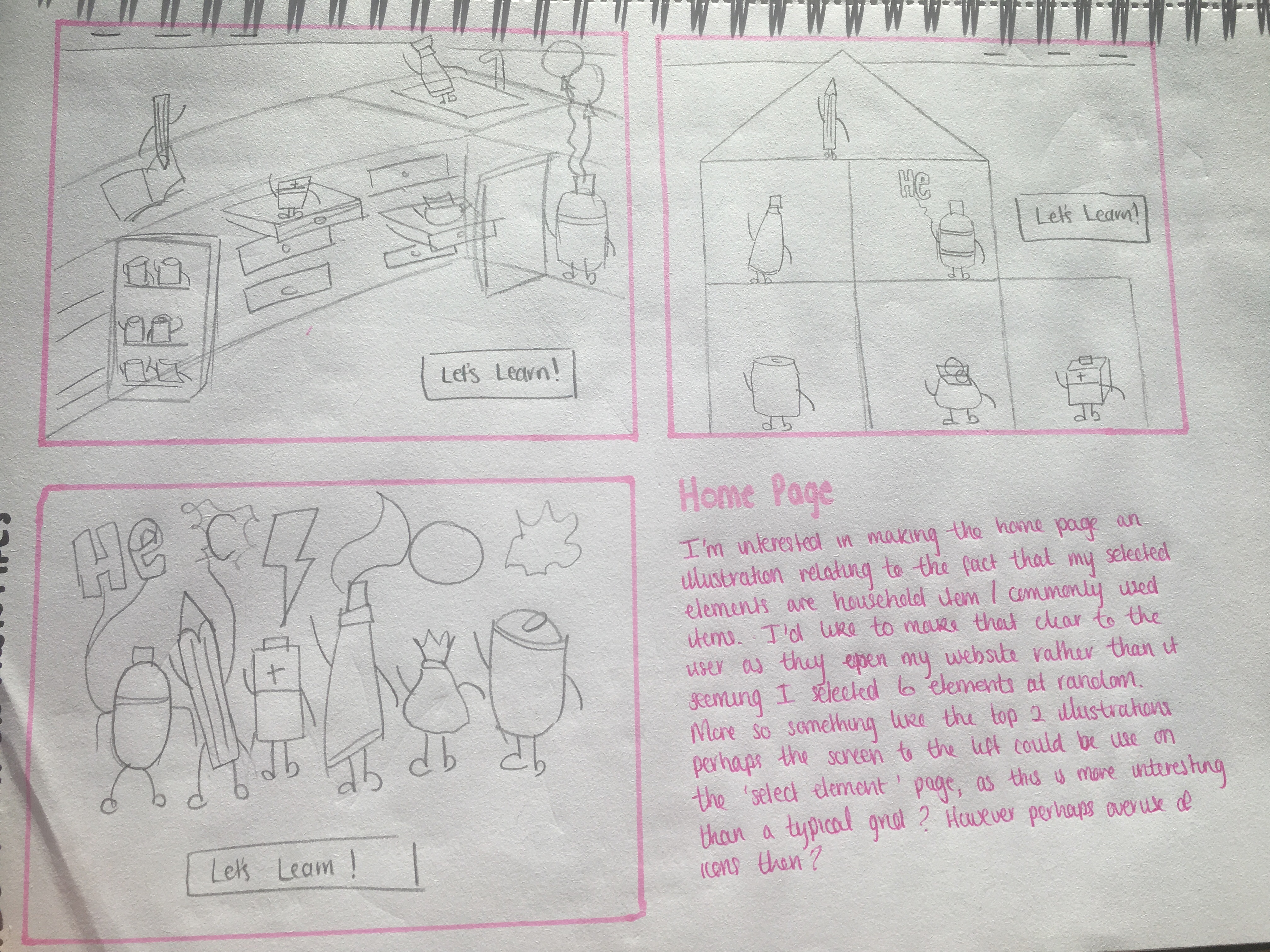
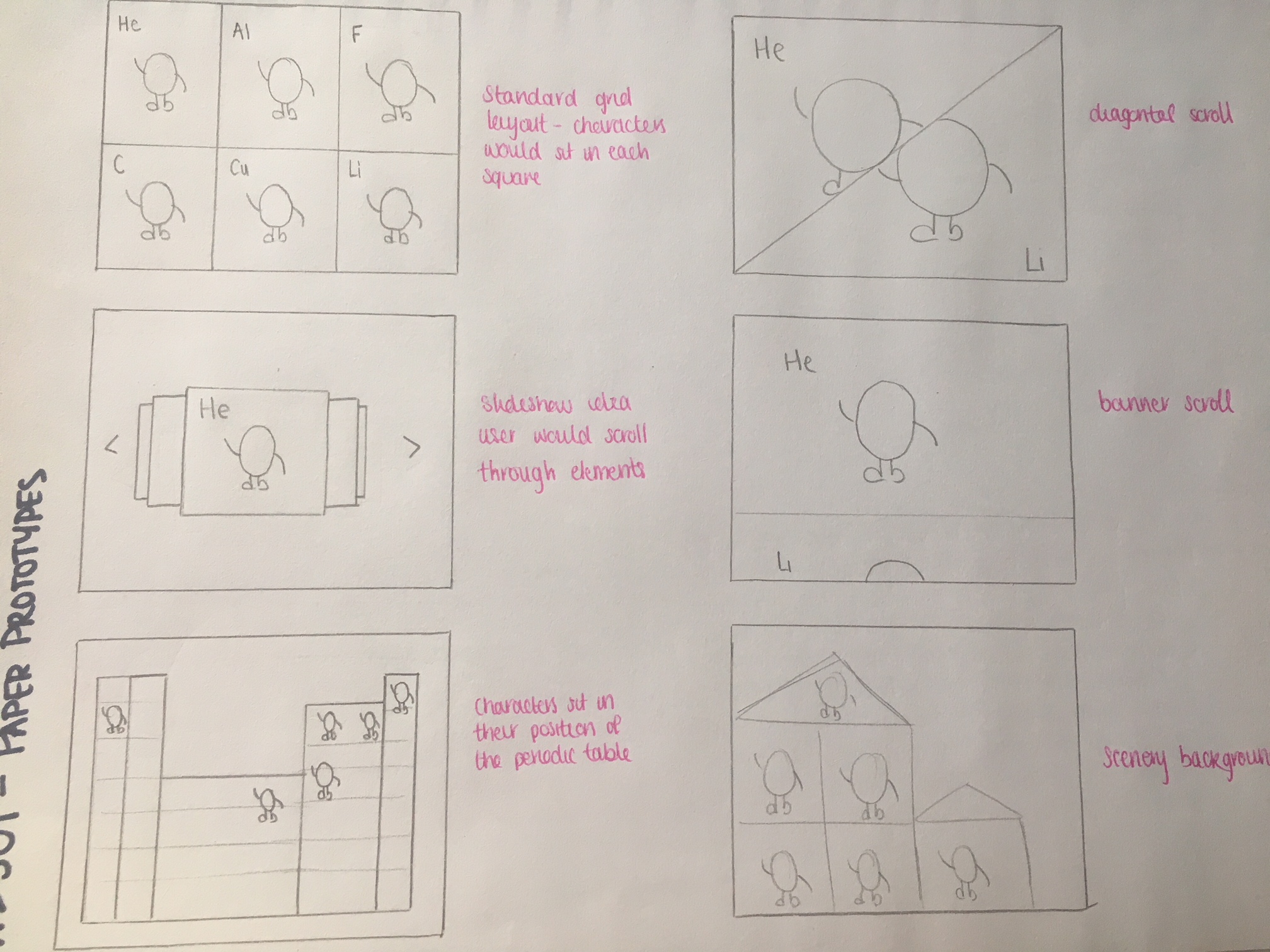
Building up a range of sketches in order to explore how I could present each screen of my website. Home: Shown to the right, I wanted to make it an illustrative and animated scene so that the theme of my elements is easily recognised as household items. Selection: Sketches on bottom left. I drew out possibilities of how I could present my 6 chosen elements in order for the user to select and read further. Perhaps using a grid layout, slideshow or further use of imagery. Information: Sketches on the bottom right. Again a few different ways in which I could present the information about a particular element.
User Flows
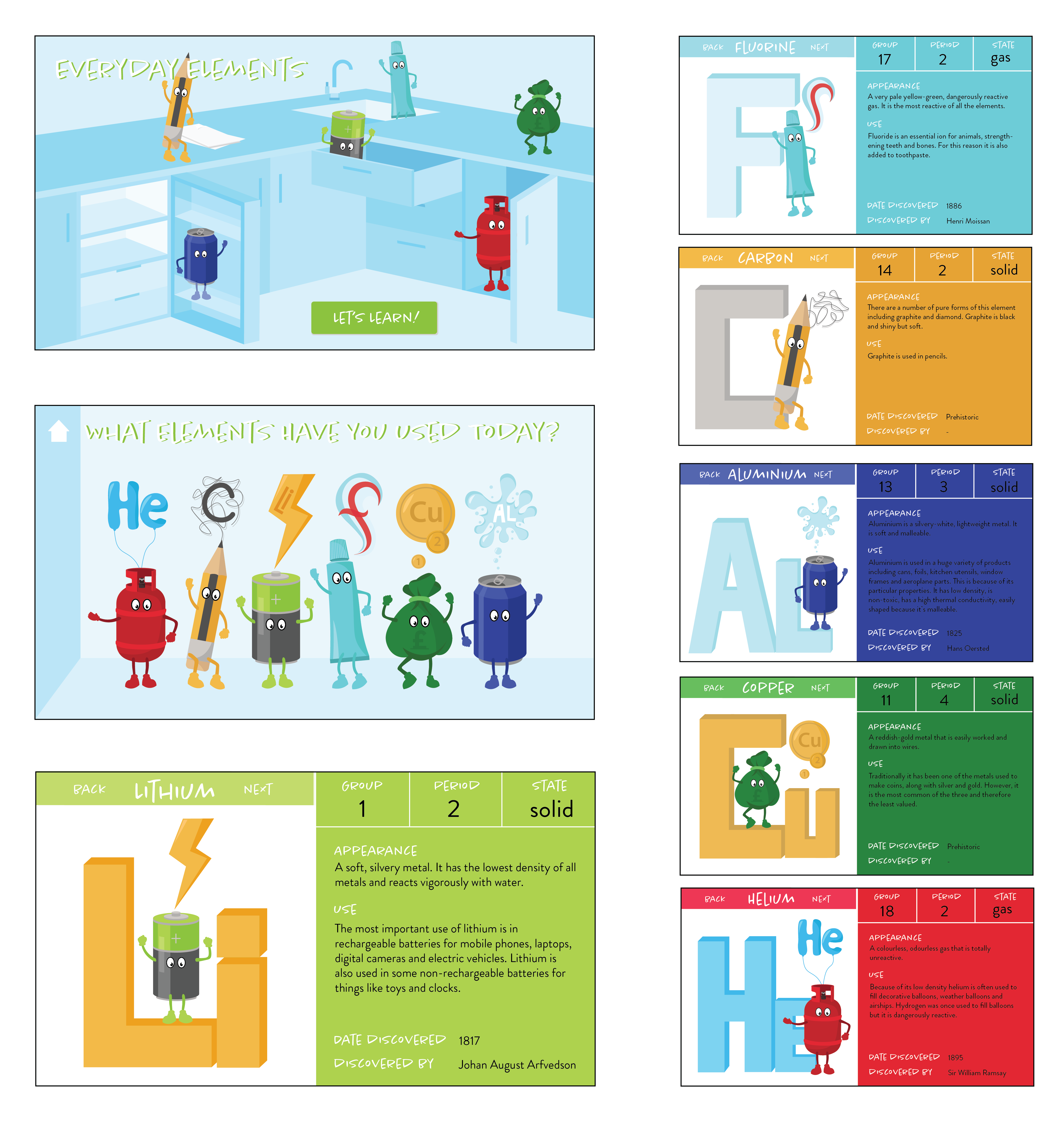
From sketches to higher fidelity mockups, I kept the user flow as simplistic as possible as I find that the less pages and less complicated links the better as the user has come for the single purpose of finding information about a particular element. This is particularly important because my website is for children and therefore they need to be able to easily navigate through my website on their own.
Branding and Style Tiles
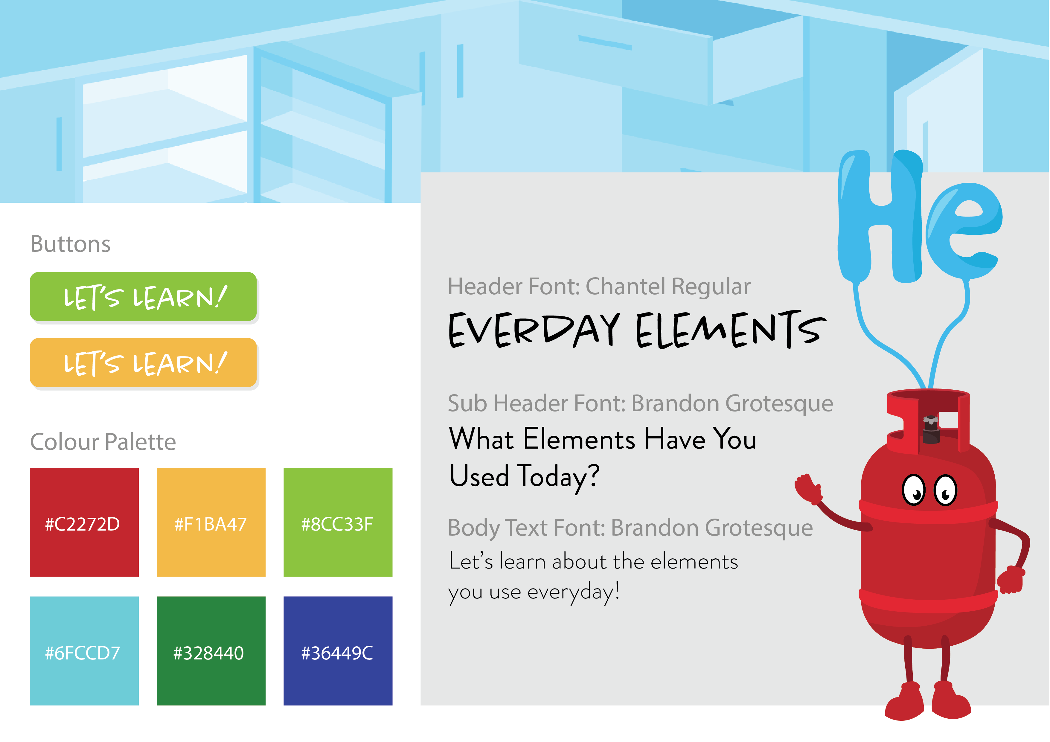
I created a quick style tile to round up the overall look of my website. The main factors considered before I begin building were typography and colour. The colour palette is based on the colours of my characters, using bright primary colours as they are associated with children the most. The header font was chosen because I felt it had a reflection to kids hand writing - big, bold and uneven. Then a clear sans serif secondary font so that it is easily read.
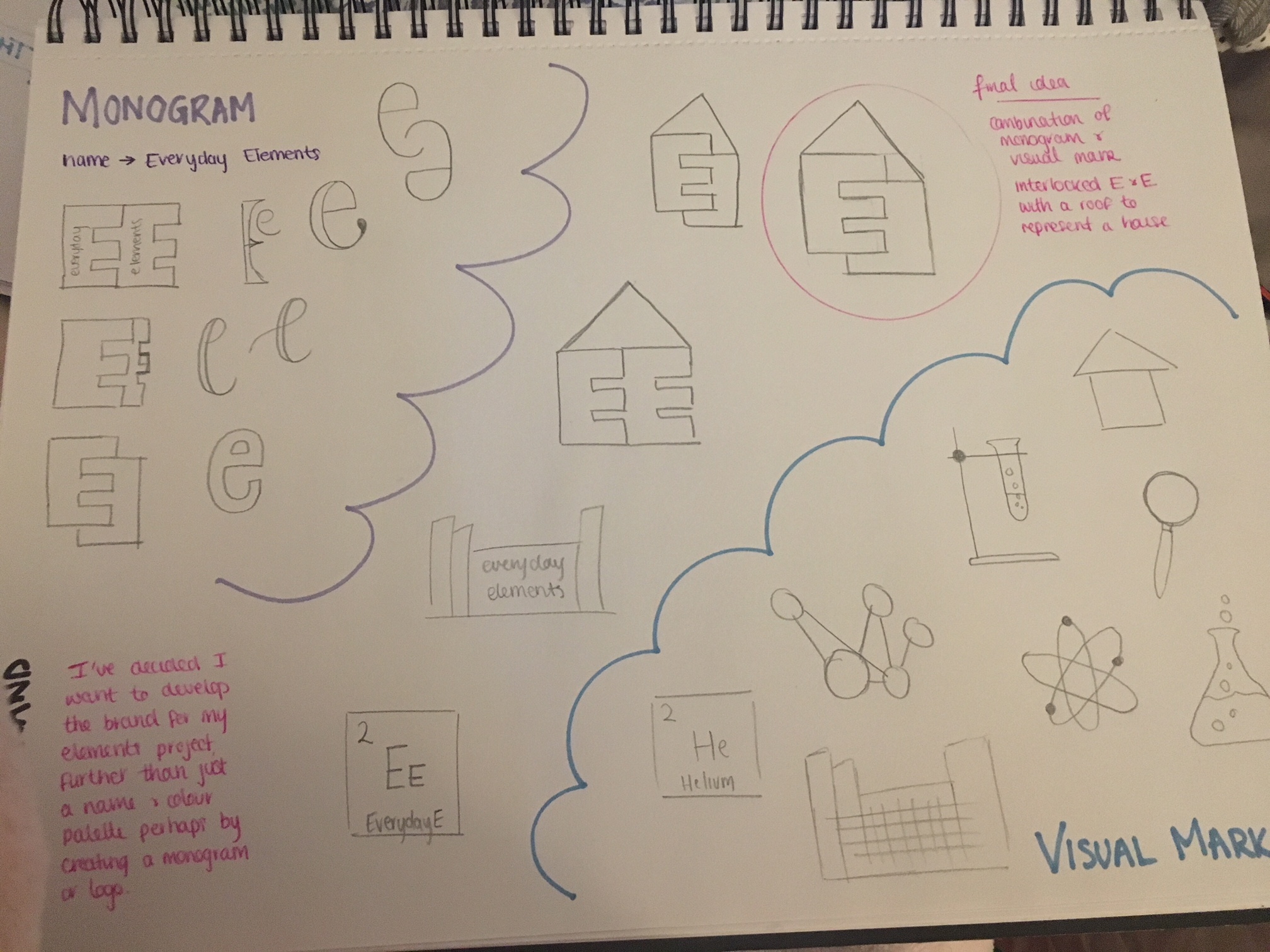
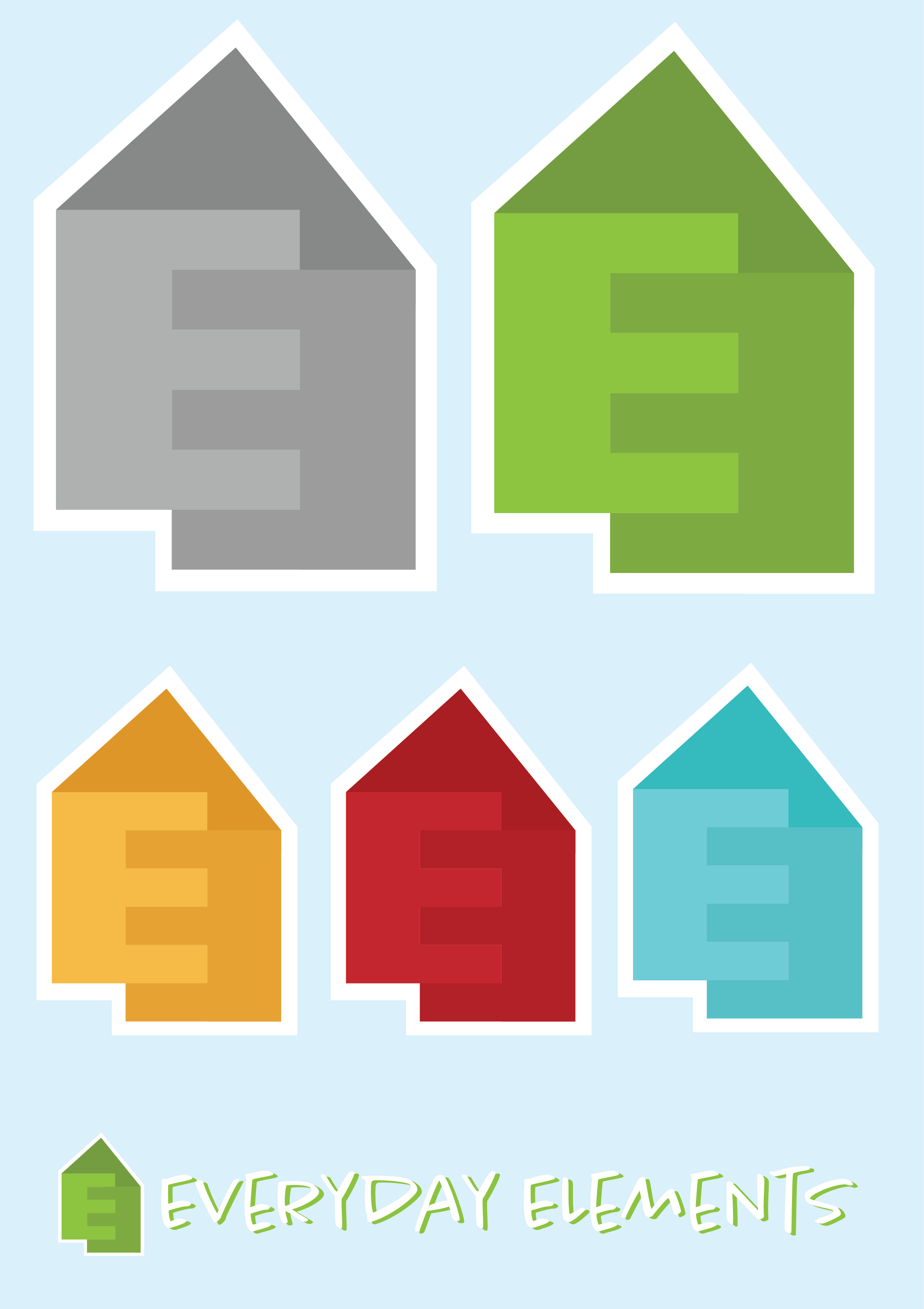
I decided I needed to make more of a brand out of this elements project, as identified from my style tile I really only had a name and illustrations. Looking at either creating a monogram or visual mark to tie my brand together, I began roughly sketching quick ideas and soon after came up with the idea digitalised above. A mixture between a monogram and visual mark as it uses interlocked E’s standing for 'Everyday Elements', topped with a roof like triangle to represent a house. Again reflecting back to the theme of my elements project that talk about the elements you use on an everyday basis/ can be found at home. I plan to use this icon as a home button navigating back to the first page.
Reflections
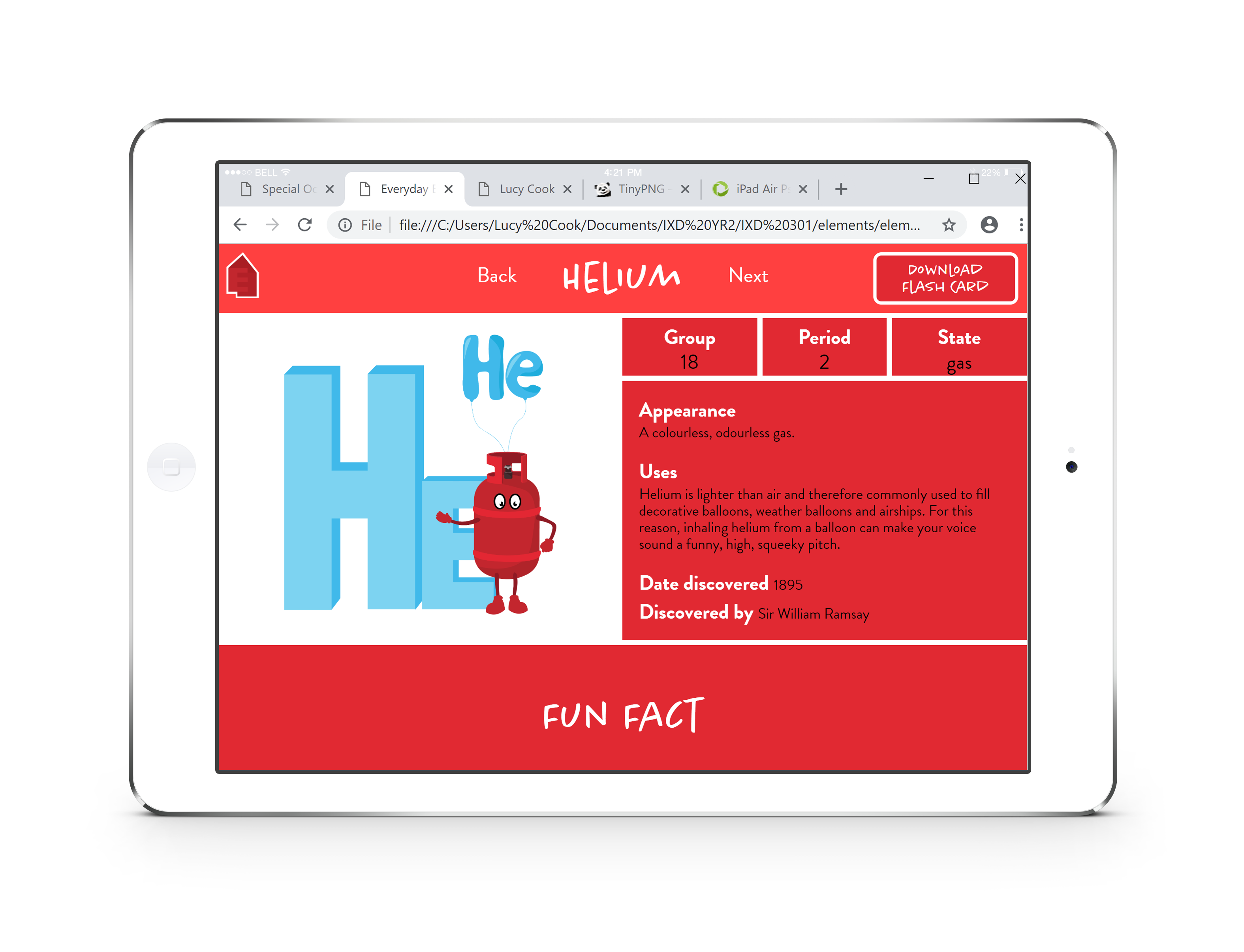
After several iteration processes, I am now happy with the website I have produced. I believe I have achieved the goals set from my user personas. My main aim was to make learning about elements of the periodic table more relatable and enjoyable for children so that they can learn while having fun. I believe I achieved this with the use of illustrations, animations and other informative areas such as including fun facts and downloadable revision cards. I think I have successfully achieved consistency throughout my website in terms of colour, layout and easy navigation paths making it appealing and easy to use for children. Therefore overall I am pleased with the outcome of this elements project so check it out for yourself!