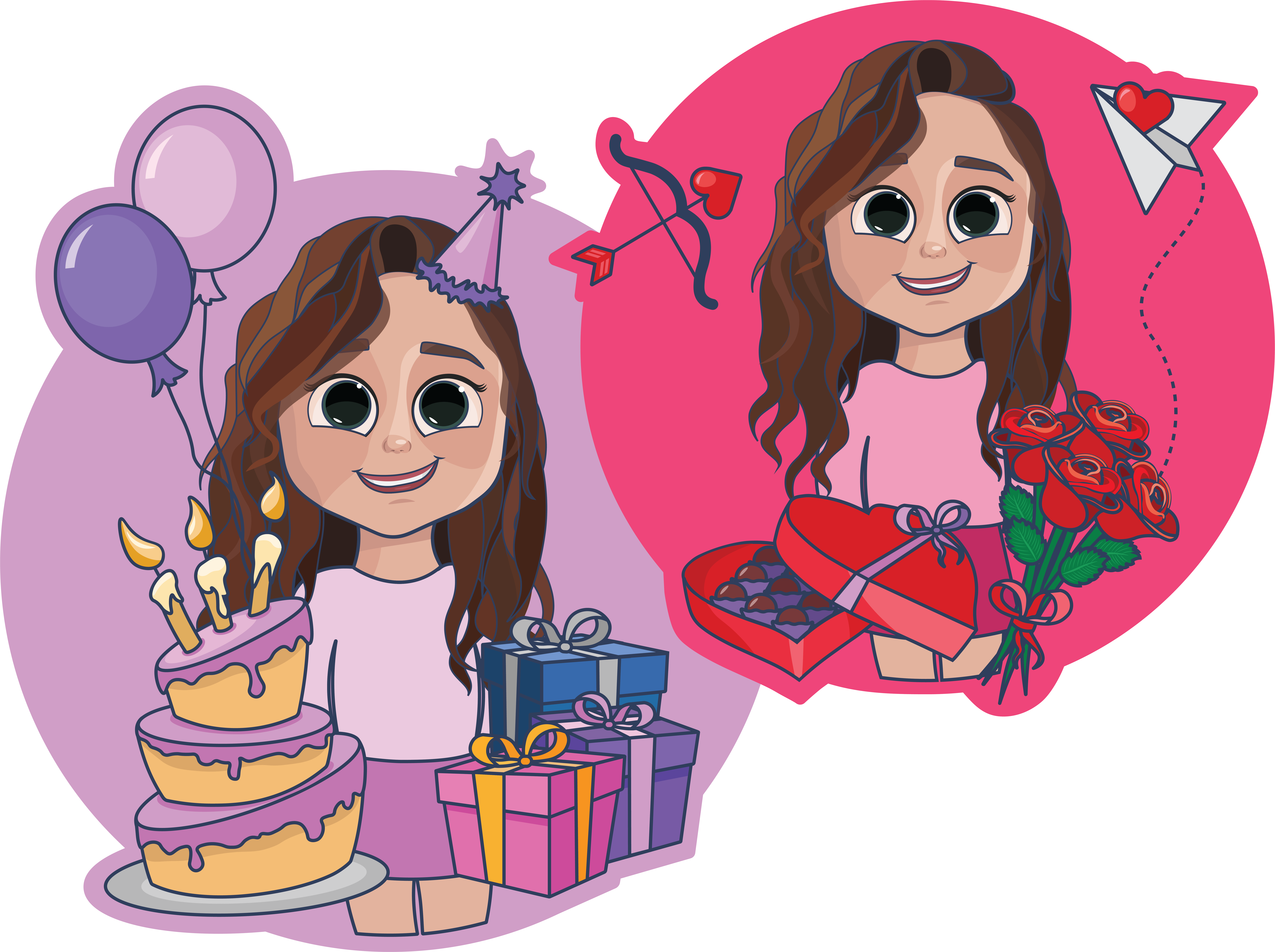
I found it hard to think of an idea that was original or that I could execute differently. Therefore created a mindmap of themes, trying to find those topics that have at least 12 different elements. 'Special Occasions' was my topic of choice as I could immediately visualise an original icon idea, as well as the possibility for future sale. Below you can see an inital mockup of my first icon for 'Birthdays'. It involves the design of a main character surrounded by smaller icons of things associated with Birthdays.
My aim for this project is not only to produce 12 icons but perhaps turn my icons into a product on the likes of cards and wrapping paper. Therefore I decided to make a visit to Paperchase to gather inspiration, as it displays walls filled with endless illustrative cards. It was useful to see the different card topics as there were some occasions I hadn’t considered before. As well as checking out the different styles of illustration, many followed a hand drawn approach whereas mine will be vector based. It was good to see that none of the cards I had looked at followed the same design as my idea and therefore I believe a potential gap for my designs!
Sketching it out
I’ve sketched out the initial idea for all 12 icons, not so much grasping the style of icon design but more so getting an idea of the images I want to include for each special occasion so that I can begin following a layout. You can see from my sketches which special occasions I narrowed my icon set down to - Birthdays, Valentines, Saint Patricks, Easter, Halloween, Thanksgiving, Christmas, New Years, Tooth Fairy, Graduation, Wedding and First Baby.
Digitalisation
I started by illustrating the images at the front of each icon following a similar style to Alex Kunchevsy, who I completed a master apprentice exercise shown below. Similarly I have chosen to outline my icons and include areas of shadow and highlight however using 3D shapes rather than creating a flat icon.
Desiging a Character
To consider the shape of my character, I decided that I like my character to have a big head and big features as I just think these characters look more fun and cute, and potentially easier to illustrate? Like the characters that David Alvarez illustrate. I followed his youtube tutorials in order to get the right shape however stuck to my style of illustration so that it fit in with the rest of my icon. As you can hopefully tell, I designed my character to look like me as I thought this would be fun. As I develop this project further I will introduce more characters with the idea that my icons can be personalised.
A Complete Icon Set
After revisiting multiple times, here is the first look at my complete icon set for every special occasion. I like how uniform they are as they sit together which is what is most important when creating an icon set. I believe that the majority of icons look similar to my original sketches and others follow slightly different arrangements or include added background icons in order to fill white space and make the full set more uniform in terms of shape and colour.
Reflections
I am pleased with how my icon set has turned out and would love to see them as a selling product in future. I have the idea that my icons would be printed on cards, wrapping paper and gift boxes, similar to what is shown on the right to be sold online or in card shops. I want to expand my library of personalised characters, so that the icon character could look like the person you wish to buy a card for. I think this idea is fun and perhaps something that I don't think has been explored in the same way.Research Notes
Promotional Webiste
As I continue developing my product of digital icons, it was important to create a promotional website where my icons could be viewed individually, downloaded for use and personalised with the ease of a quick email.